Golf Channel
Role: Director, Digital Design and UX
As the Director of Digital Design and UX, I led a team of designers and front-end engineers responsible for golfchannel.com, the Golf Channel mobile app, and other golf-related digital properties. My role centered on discovering innovative ways to engage global golf fans and developing new sponsorship opportunities that generated revenue for NBC Sports' digital team. My UX team collaborated closely with Product, Engineering, Editorial, Video Production, Marketing, and on-air teams to create a leading digital experience in the golf industry.
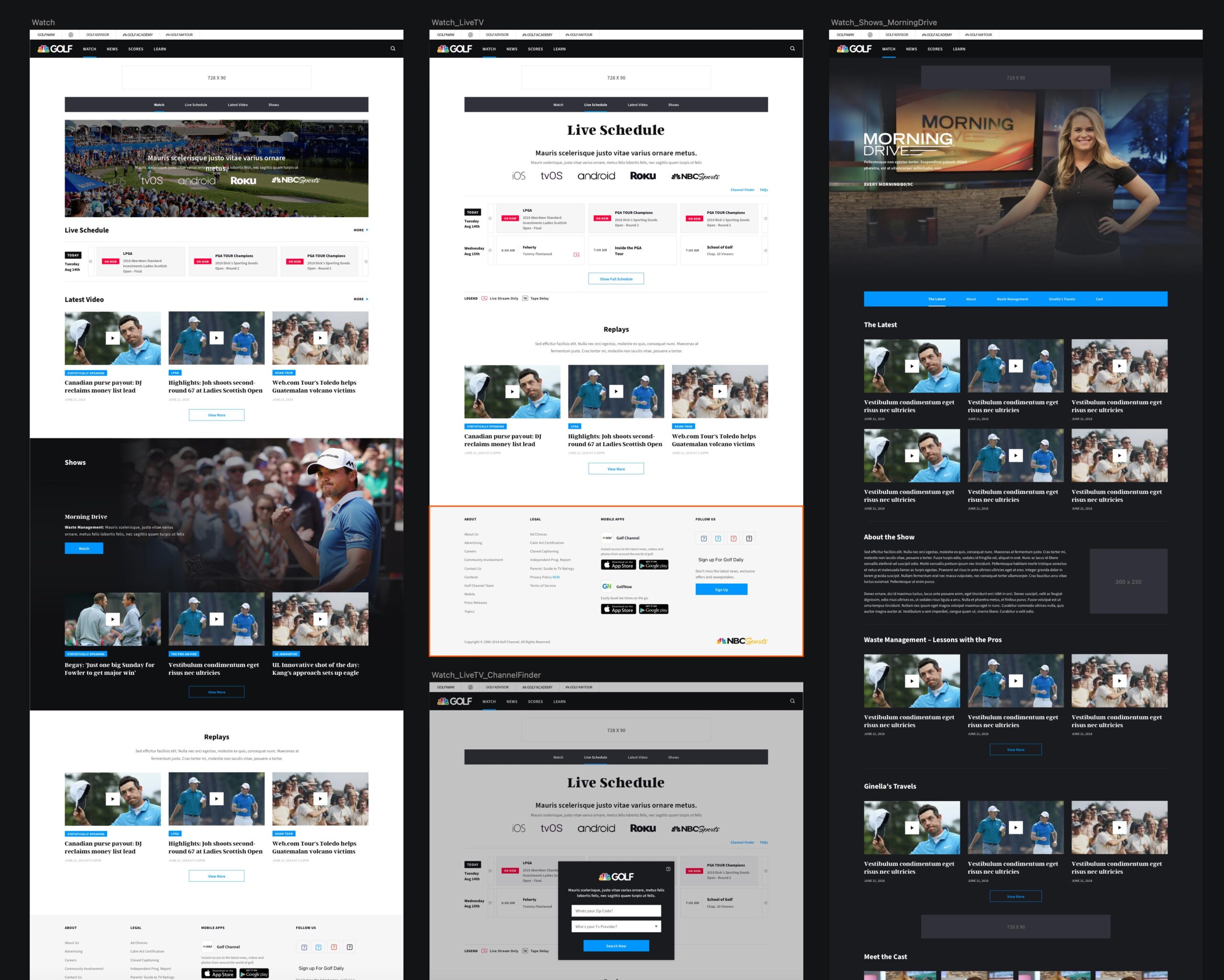
One of the first major tasks I was asked to undertake was leading a redesign of GolfChannel.com. The existing website felt outdated and didn’t reflect the dynamic, cutting-edge feel of Golf Channel's television presence. My goal was to create a digital experience that mirrored the excitement and sophistication of the broadcast product, focusing on modernizing the user interface, improving usability, and crafting a visually engaging layout that would appeal to a broad audience of golf enthusiasts. This effort included not only enhancing the look and feel but also ensuring that the website offered a seamless, intuitive experience aligned with Golf Channel’s brand identity.
Golfchannel.com - 2015

Discovery
Our research—both passive and active—indicated that users were highly engaged and enthusiastic about the product. However, internally, there was a growing perception that the design felt outdated and no longer aligned with modern aesthetics or user expectations. Recognizing this, business leaders agreed to hold discovery sessions to determine content priorities for a redesign of the site and mobile app, aiming to deliver a cleaner, more contemporary look without sacrificing the elements users loved.
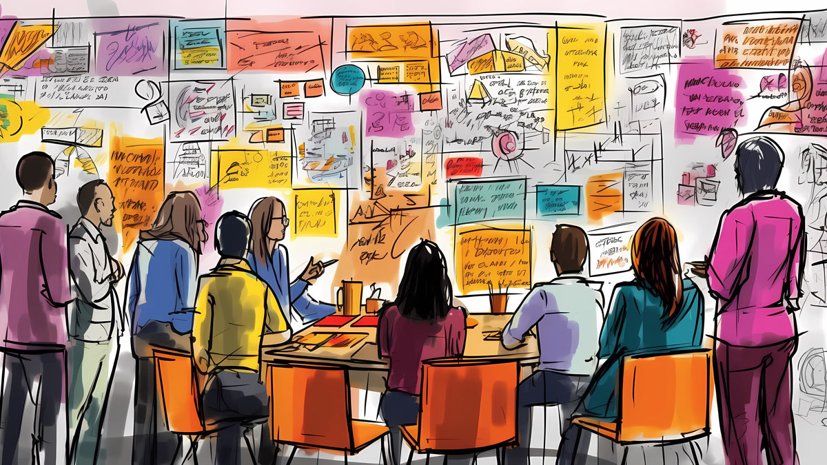
To kick off the project, my team and I developed a style moodboard that set the visual direction for a refreshed, cohesive brand experience. We then facilitated Feasibility, Desirability, and Viability Scorecard meetings with departments across the organization, using the resulting scores to help prioritize content and features for the redesign. This collaborative approach allowed us to align on a vision that balanced innovation with familiarity, ensuring the new design would resonate strongly with both internal stakeholders and end users.
Scoring
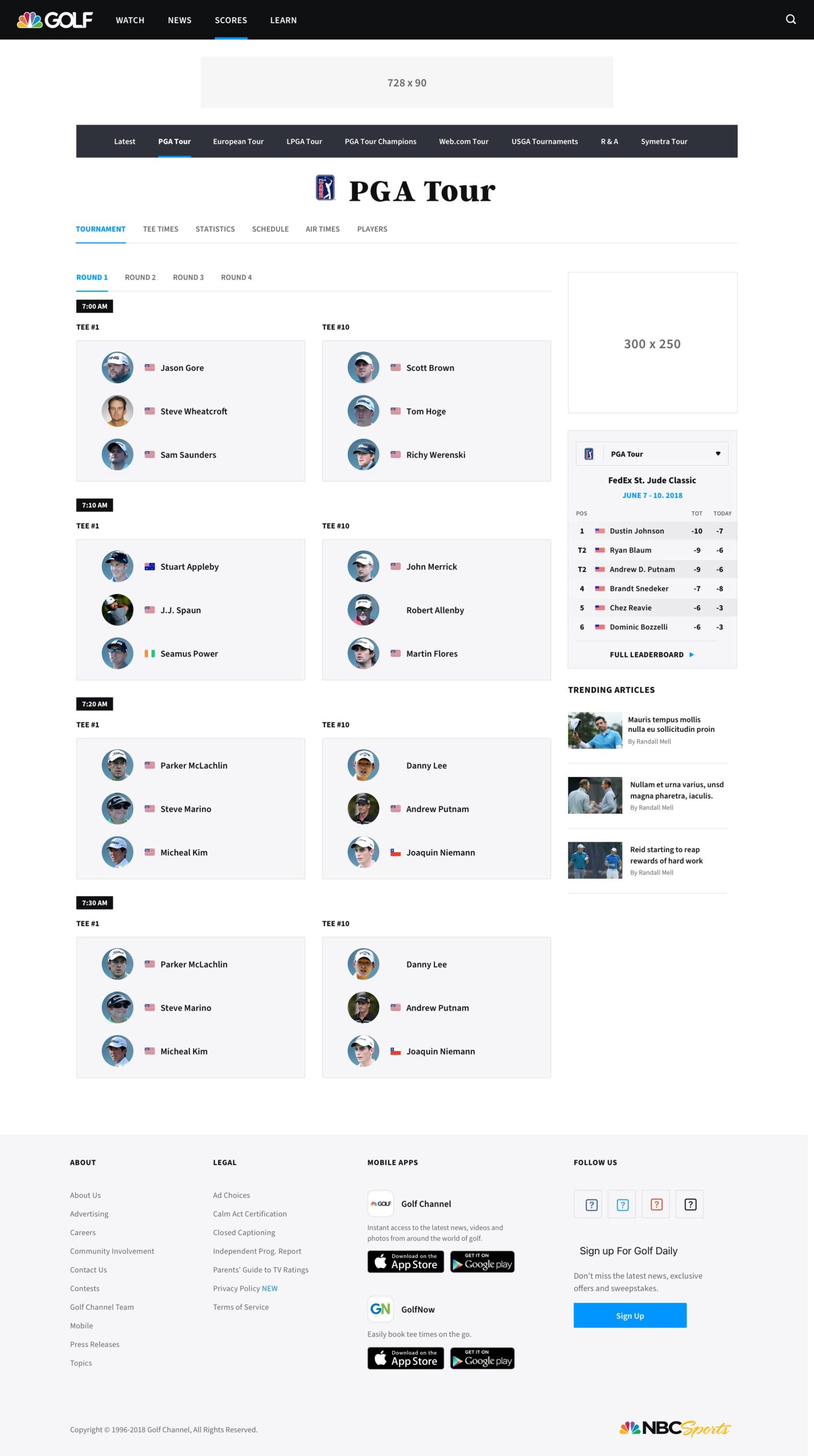
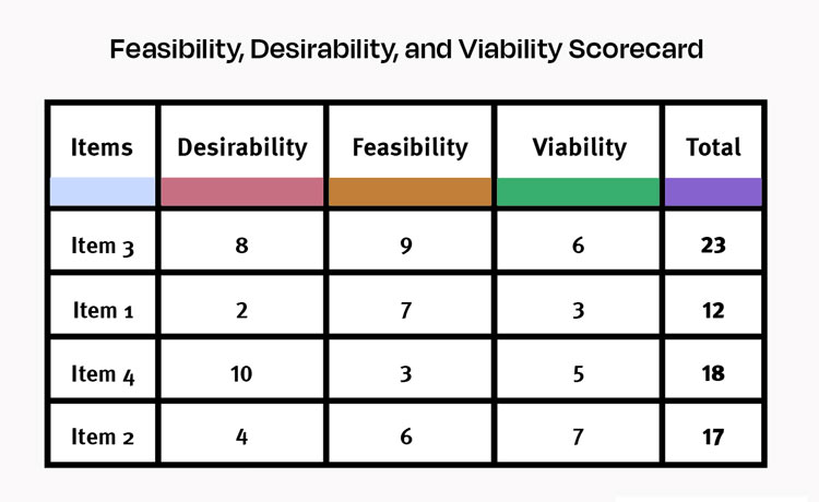
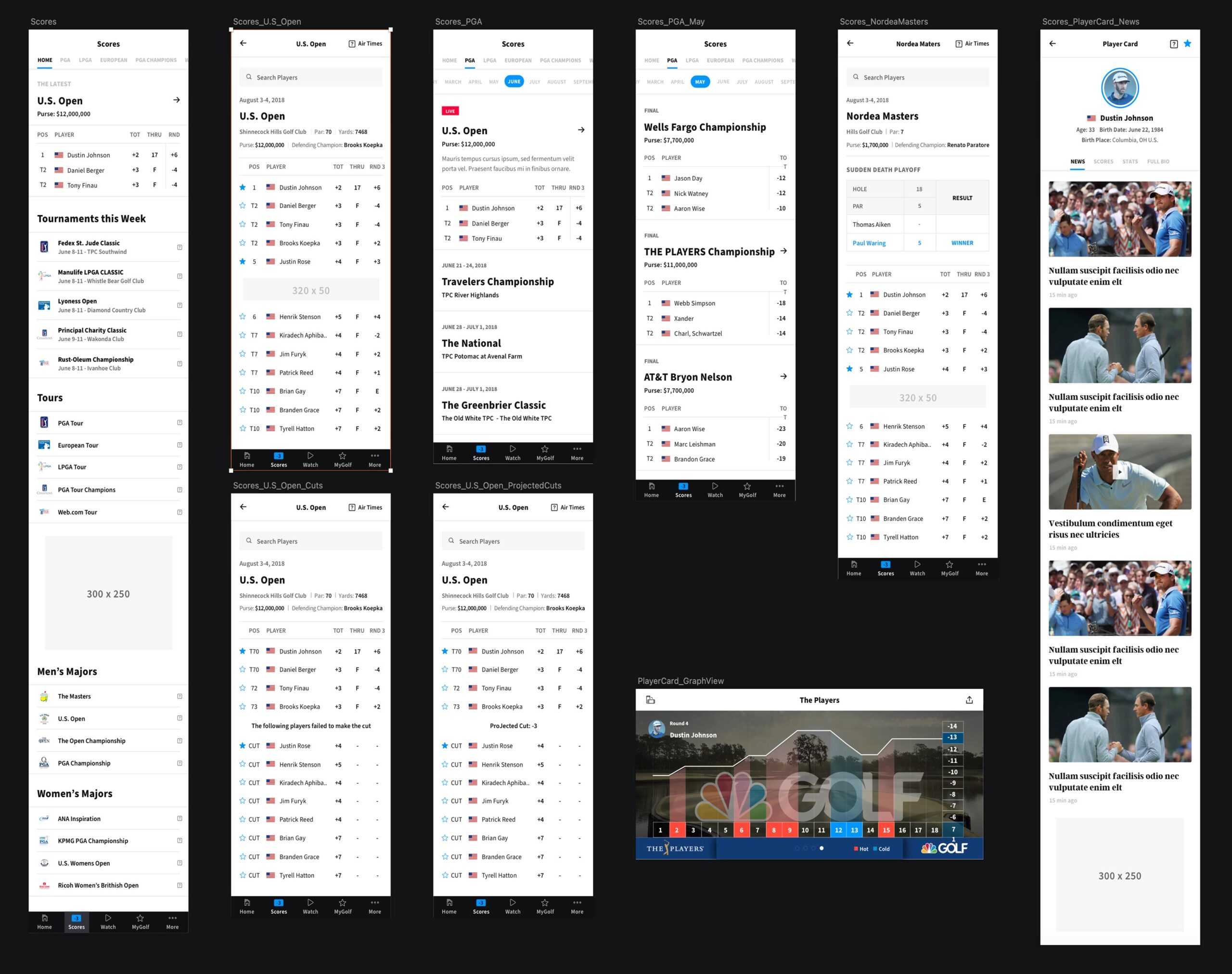
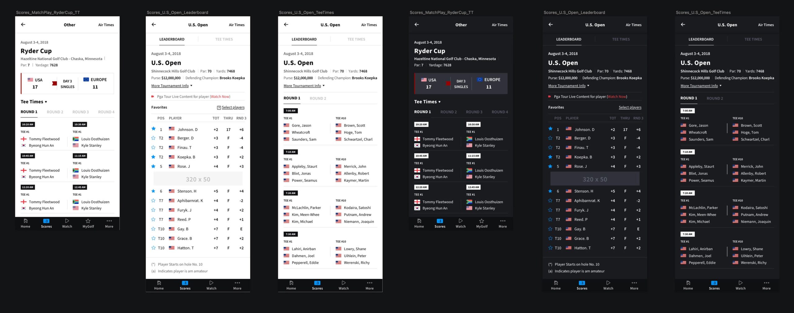
Using the high-priority items identified in our Feasibility, Desirability, and Viability Scorecard meetings, my team and I launched a series of design thinking sessions to address these key areas. The highest-ranked focus across all groups, backed by data on strong user engagement, was enhancing the Scores pages.
One element used across the site to display live scores was a ticker at the top of the page, intended to provide quick, at-a-glance updates. However, user testing revealed that much of our audience found the ticker difficult to use and less helpful than expected, emphasizing the need for a more accessible way to present scores.
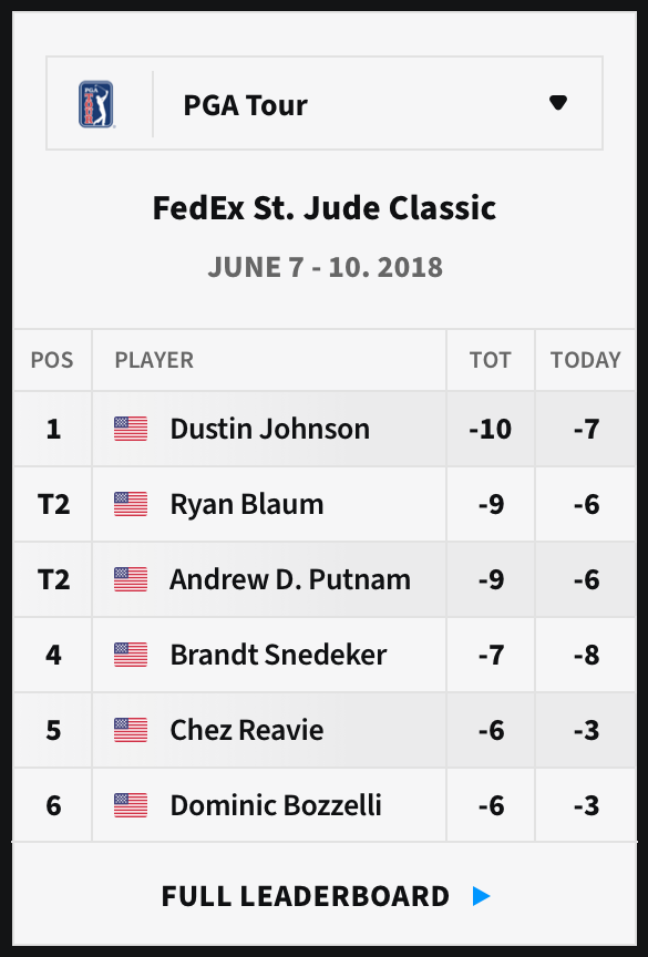
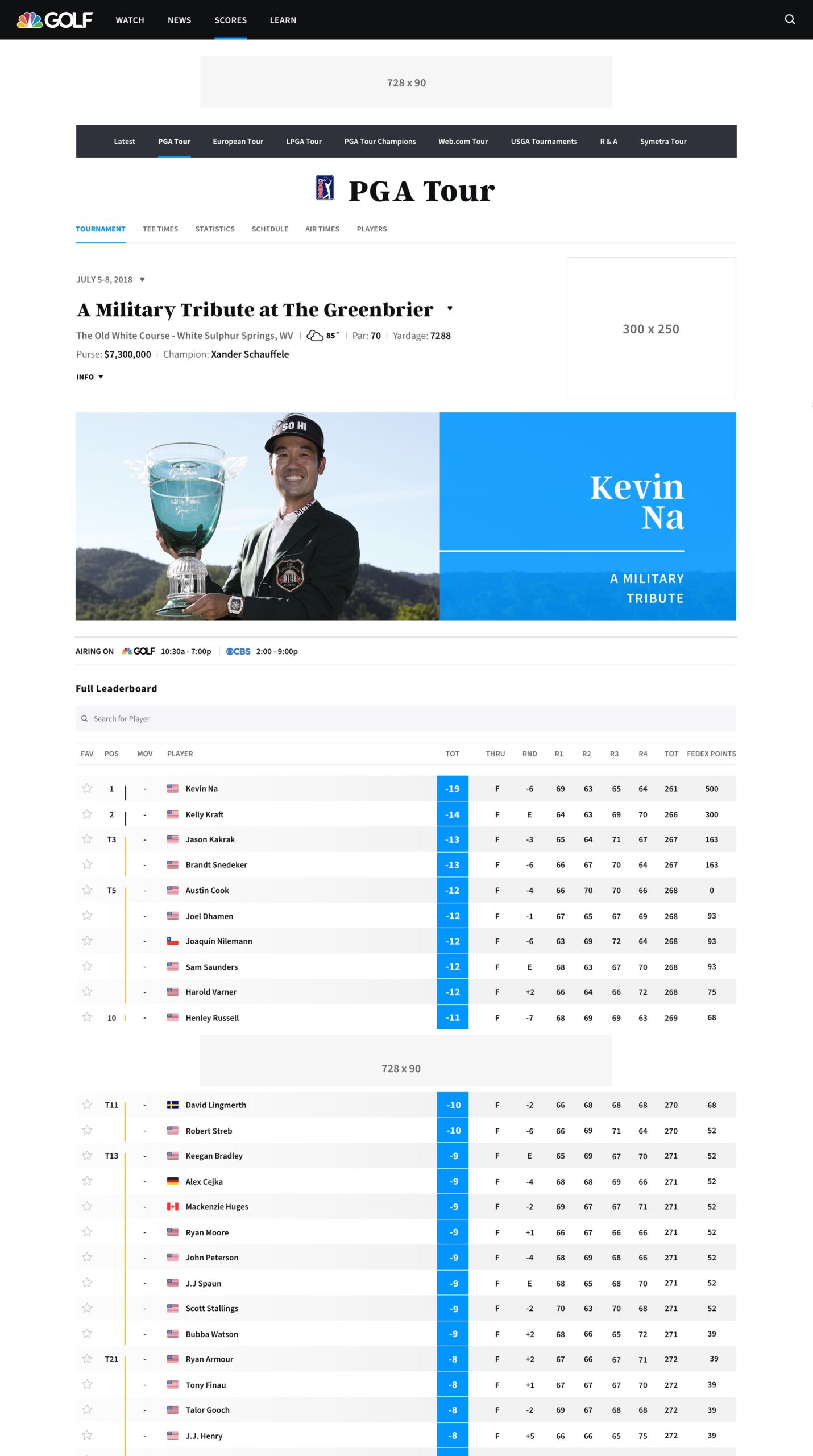
Based on this research data, we adjusted our approach to more effectively meet user needs and explore new revenue opportunities. Through this process, we developed and tested multiple concepts, with the Leaderboard Glance standing out as the optimal solution. This feature allowed users to quickly see the top six golfers in any tour, with easy navigation to the full leaderboard for more detailed insights.
Results
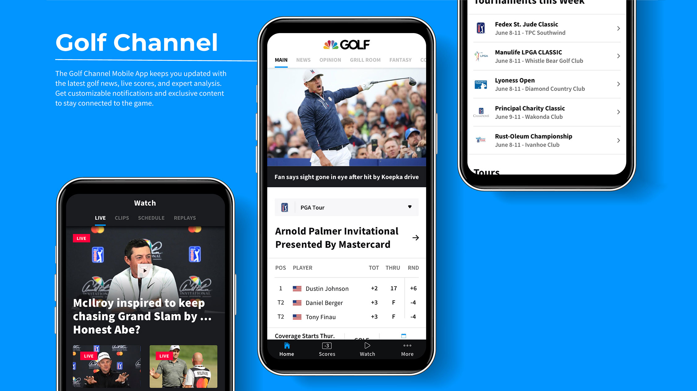
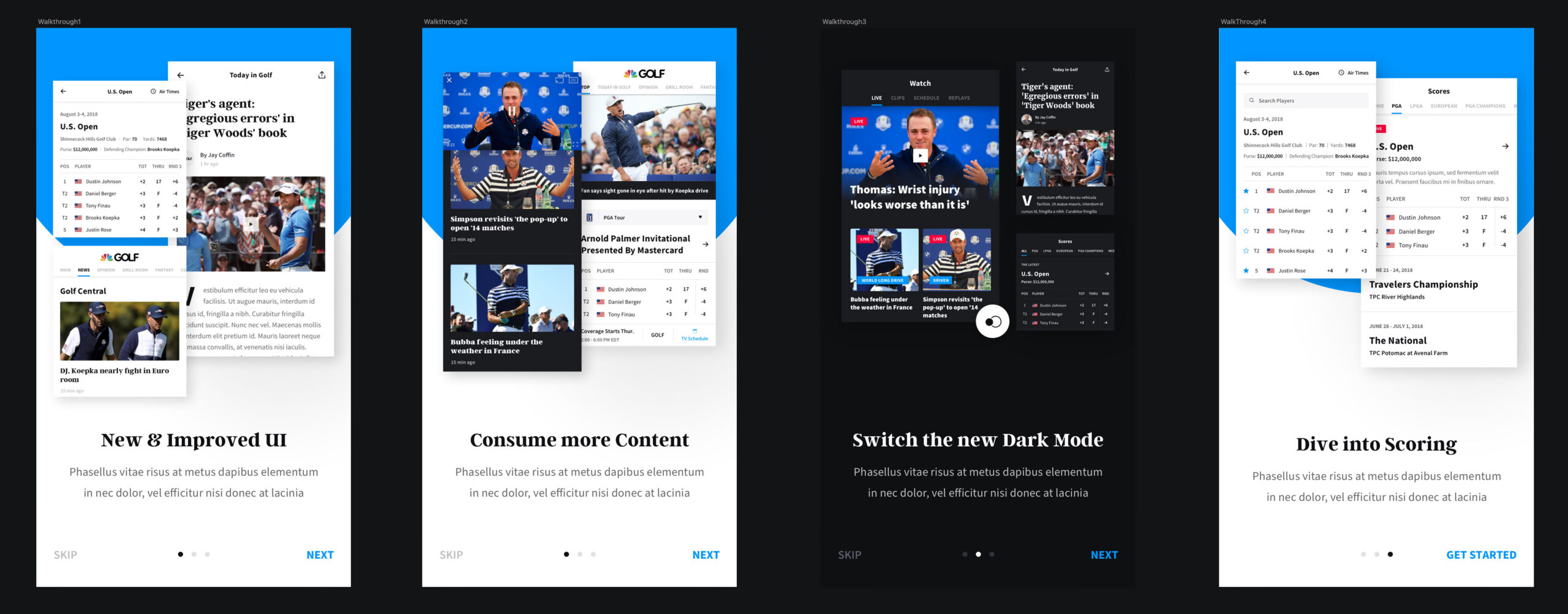
We prominently positioned the Leaderboard Glance in the top-left corner of both the Golf Channel homepage and mobile app. This placement, alongside the feature’s user-friendly design, garnered enthusiastic feedback from both users and stakeholders. The Leaderboard Glance not only improved score accessibility but also attracted sponsorship, ultimately generating over $1 million in annual revenue—making it a resounding success for both user experience and business goals.
Final Designs
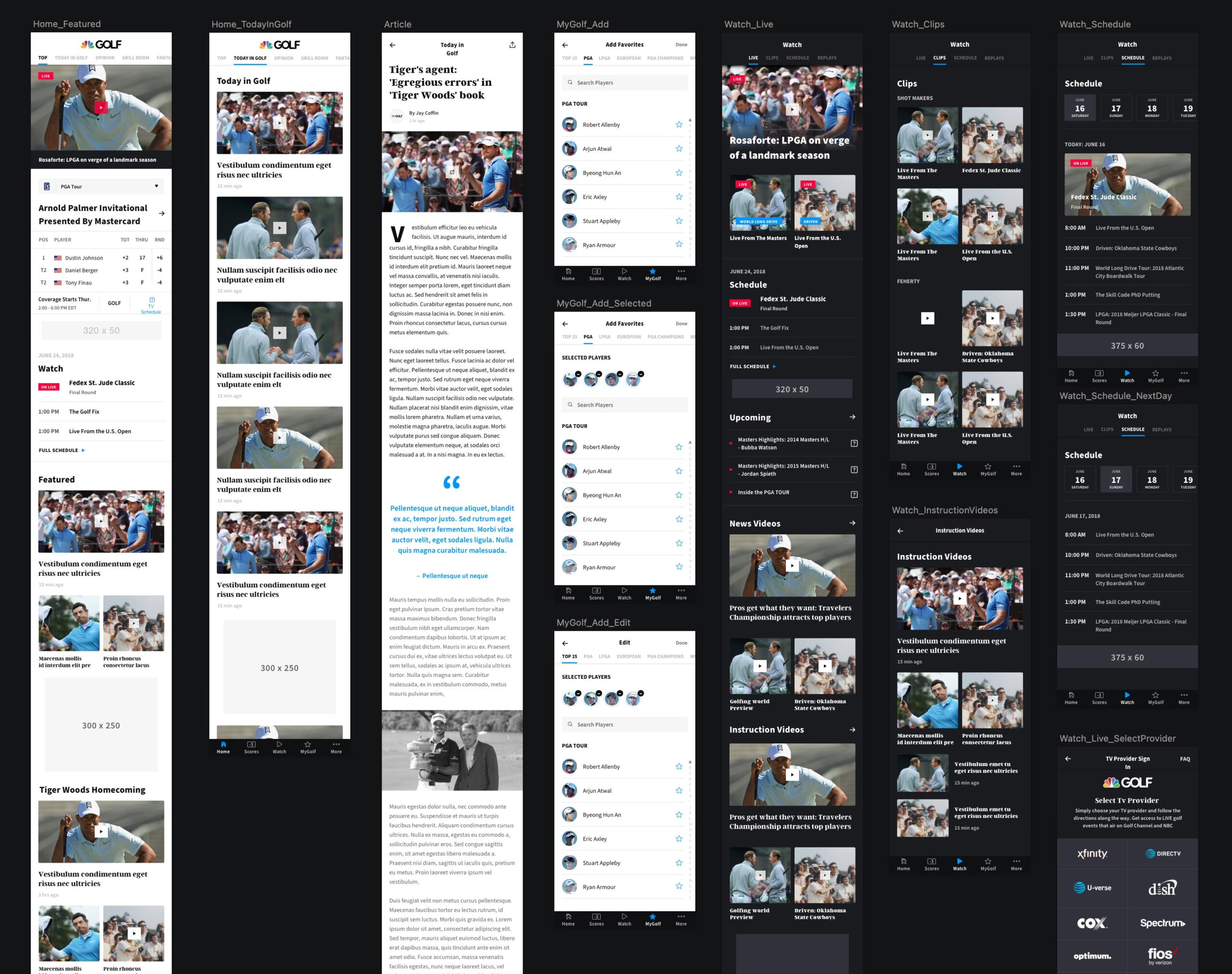
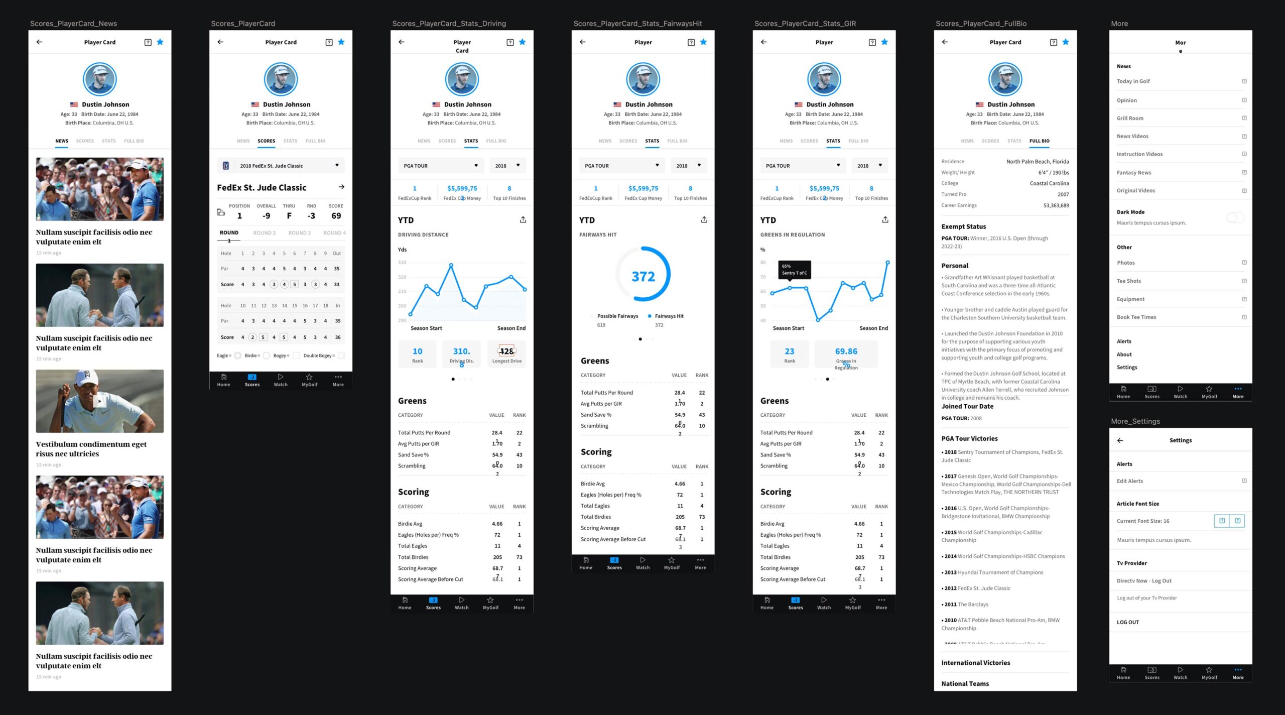
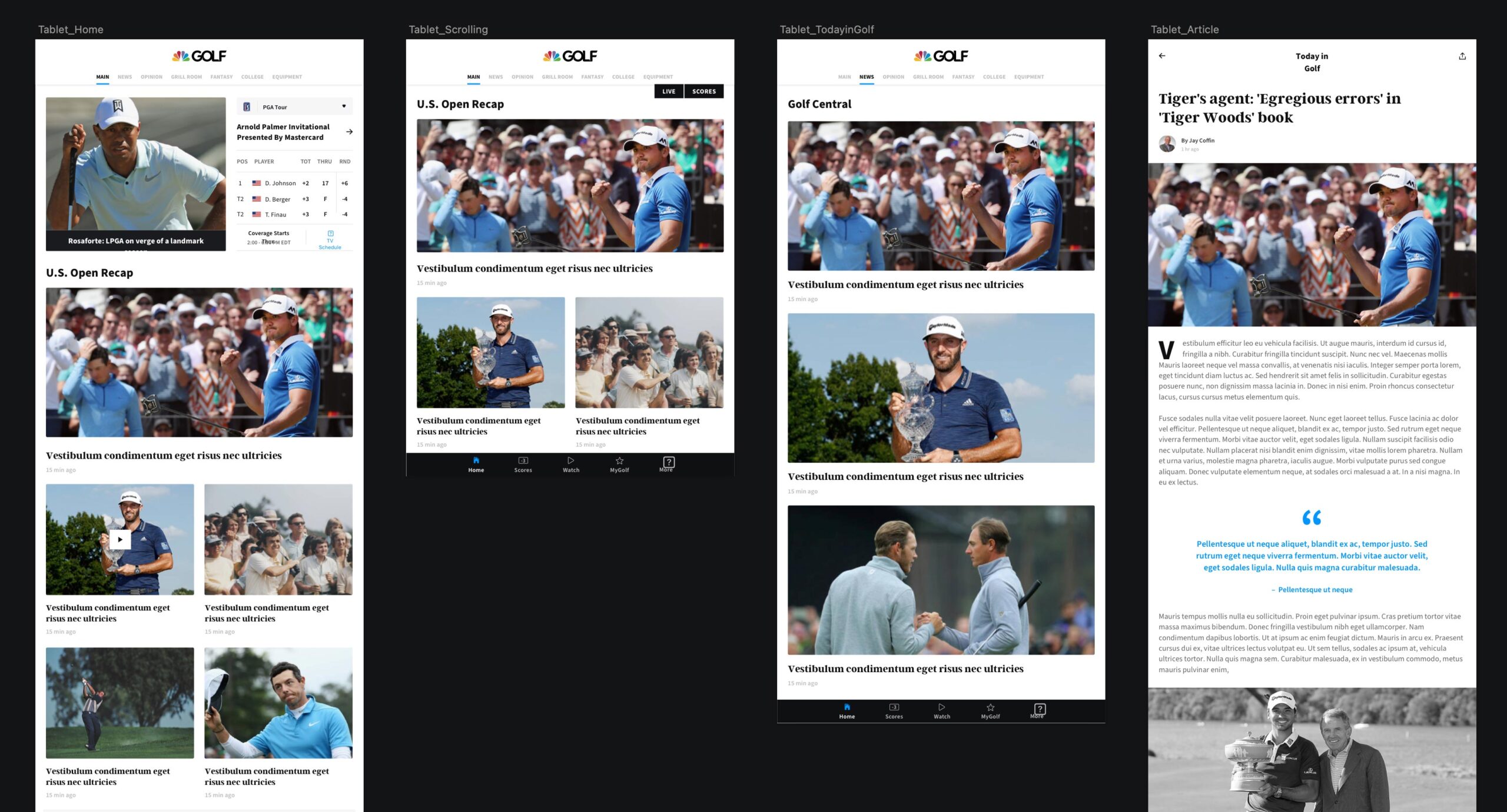
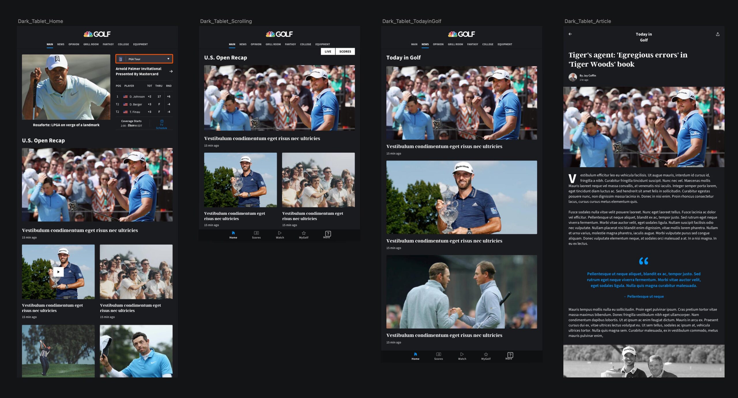
The final designs for the Golf Channel’s web and mobile platforms brought a fresh, modern aesthetic to the forefront, reflecting the brand’s dynamic presence while enhancing usability. Our redesign emphasized clean lines, ample white space, and a balanced color palette, allowing content to stand out and guiding users’ attention naturally to key areas. The layout was carefully constructed to prioritize high-engagement features, such as scores, highlights, and live content, providing easy access to essential information without overwhelming the user. Each design element was crafted to feel intuitive and approachable, ensuring that new and returning users could navigate with ease.
One of the standout features, the Leaderboard Glance, exemplified our focus on usability and engagement. Positioned in the top-left corner of both the web homepage and the mobile app, it allowed users to quickly see the top golfers at a glance and seamlessly navigate to the full leaderboard for more in-depth information. This feature not only improved the user experience by reducing cognitive load but also created new sponsorship opportunities that proved valuable. The final design integrated well with Golf Channel’s brand identity, providing an immersive and accessible experience that resonated with users and stakeholders alike, setting a strong foundation for the future of Golf Channel’s digital products.
Design System
The initial design system for Golf Channel's digital products was created in Sketch, organized across several files that reflected the core information architecture. While this setup offered a straightforward structure, it was relatively simple for a fully-fledged design system. Over time, it developed into a more comprehensive collection of components with various levels of complexity, grounded in Brad Frost’s "Atomic Design" methodology. This approach enabled us to build a scalable, flexible system that maintained consistency across all digital touchpoints as the design matured.

App Store

Mobile App

Tablet
Website